Loading...
Created at 11/17/2019 11:14
Procreate design dont be embarrassed hex colors
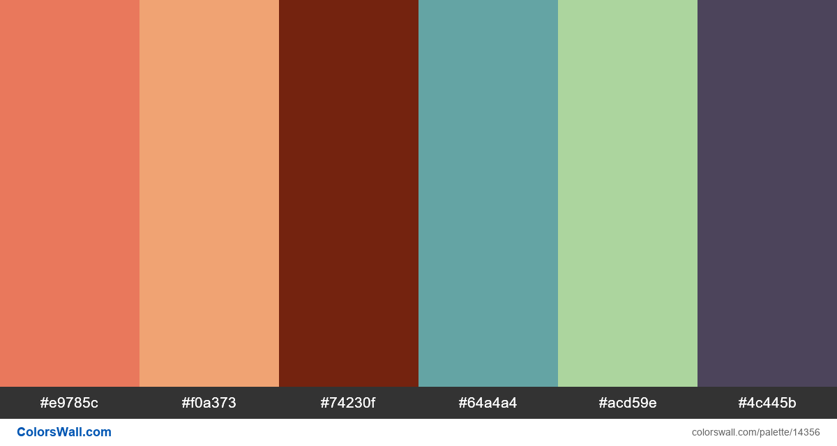
- #e9785c
- #f0a373
- #74230f
- #64a4a4
- #acd59e
- #4c445b
The palette consists of Light colors. Accent colors #f0a373 and #64a4a4. Palette has Warm, Cool, Neutral colors temperature.
By lightness, this palette runs from #74230F (darkest) to #ACD59E (lightest). The lightness range is moderate.
Saturation is mixed — some muted swatches and some vivid accents.
Some hue pairs sit near complementary positions — you may read this as complementary contrast (loose heuristic).
Overall temperature among swatches leans warm.
HEX codes (sorted): #4C445B, #64A4A4, #74230F, #ACD59E, #E9785C, #F0A373
Palette Procreate design dont be embarrassed hex colors has combination of 6 codes colors:
HEX: #e9785c, RGB: (233, 120, 92); HEX: #f0a373, RGB: (240, 163, 115); HEX: #74230f, RGB: (116, 35, 15)
HEX: #64a4a4, RGB: (100, 164, 164); HEX: #acd59e, RGB: (172, 213, 158); HEX: #4c445b, RGB: (76, 68, 91)
Simplified version of palette colors
Shade of tomato, Shade of sandybrown, Shade of Maroon, Shade of cadetblue, Shade of darkseagreen, Tint of darkslateblue
Color scheme was created by colorswall
Colors codes in palette
Procreate design dont be embarrassed hex colors color codes HEX, RGB information in table
Color Palette Contrast
7 color pairs have low contrast and need improvement which may impact readability.
| Text Color | Background Color | Contrast Ratio |
#e9785c | #f0a373 | 1.39 |
#e9785c | #64a4a4 | 1.01 |
#e9785c | #acd59e | 1.74 |
#f0a373 | #64a4a4 | 1.37 |
#f0a373 | #acd59e | 1.25 |
#74230f | #4c445b | 1.14 |
Image palette Procreate design dont be embarrassed hex colors png
Export Palette
Download the "Procreate design dont be embarrassed hex colors" in multiple formats for seamless integration into your design projects.
Available formats: